What is it about the highlands which appeal to us? I sense that many Malaysians are averse to our famed hot and humid weather. That's where the highlands come to the rescue. The fresh breeze, the relatively cool climate and plenty of cloud cover make them an oasis of refuge from our hot low lands.
On that morning, the clouds met the green valleys of tea leaves, shrouding the hill tops in mystery. The journey to the Sungai Palas Visitor's Centre is an adventure in itself. Vehicles cram into a narrow winding road and they often have to take turns to make way for on coming traffic. A great obstacle at first, but later, quite alluring. The scenery is like the surprise felt when dominos fall, where each turn on the bend yields another spectacle. If looking through the
clouds was enough of a tease, don't be surprised if they draw themselves open or shut like show curtains amid your photo-snapping frenzy.
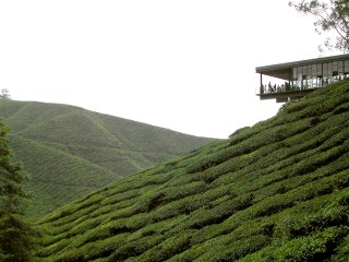
Although it can be seen from the road, the Visitor's Centre is not immediately visible unless one is observant. It is quite a treat when you consider that there can't be anything more obvious than a long object cantilevered on the ridge of a hill. At my first glance, I conceded that the design had not only sympathy for her surroundings but seemed to grow from the land, almost inconspicuous from afar.

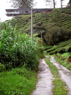
Preventing private vehicles from going to the very doorstep of the centre is praiseworthy. Evidently, the hilltop has limited space for parking lots. It is a refreshing idea, in a refreshing place, especially when very few 'new' architecture unravels itself from the very passage that leads to it. The path is a pleasant stroll by the hill's edge overlooking a valley of tea leaves. The moist ground, fallen leaves and picturesque surroundings immediately induce a desire to sit down over a cup of tea and relax. Fortunately, the hike up the hill is a mere 10 minutes at most. Thus the cravings are not easily forgotten.


Notably, the Visitor's Centre does not pop up in a 'lo and behold' manner. Instead, one notices a 'light' and long 'cuboid' volume that is perched on a hill. The scarce use of masonry and the predominant black trimmings turn an otherwise solid object into a 'window frame'. And what a sight to behold! One enters through an opening in the middle of its 'long' edge. To the left, numerous ordinary tables and chairs are laid out for the benefit of patrons sipping Boh Tea with the undulating 'green' backdrop. The educational or exhibition spaces, the shop and toilets are easily found on the right hand side.
While not entirely brilliant, the organization of spaces is very transparent and simple. But it also means that there is little 'mystery' to the architecture. Not that this is overtly simplistic, but perhaps there could have been more variety in spatial qualities, beyond the 'open' ambience through and through.
Furthermore, it appears that the simplicity of the design rests profoundly on two almost opposing ideas. The first is the composure of the structure as it is firmly anchored to the ground. The absence of a heavy base appeals to me, not the least because it holds both the feeling of 'flight' and 'firmness' in balance. The second 'idea' is of weightlessness, where the 'lightest' end seems ready to walk on air. Unlike a pool 'spring board' which it resembles, the cantilevered balcony evokes a propensity to move horizontally rather than a leap into the valley.
Nonetheless, it is very apparent that a 'centripetal force' emanates from the 'balcony', from which every other space is assigned its place and subordinated to the whole. Evidently, the crowds gathered on the balcony's edge and raced to get the best seats.
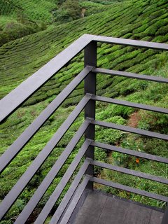
The ballustrade detail consists of mild steel strips,'to the point', making way for a clear scene to be savoured by camera snaps. The judicious use of black for the trimmings here and everywhere easily camouflages an otherwise industrial feeling into the melancholy but evergreen landscape beyond.


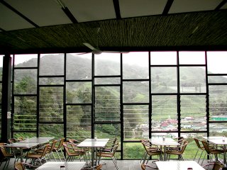
The cafe section features shutter panes framed by accentuated vertical mild steel sections. In a way these are reactionary forces to the otherwise horizontal weight of the building. They endow the facade with a different progression, not towards the sky but a horizontal scale that seems to have no end.
As you proceed to the 'rear', this 'scale' continues albeit filled with very tactile wood ornaments (these are off-cuts from trees which grew on site, prior to construction) framed between vertical members rather than shutters. In the foreground, educational posters in perspex panels are suspended between vertical tensioned wires. A series of ramps take you to the AV rooms and more exhibition
spaces at the back, adjacent to the Boh merchandise shop. It didn't escape my notice that the display wall detail for the retail outlet was a copy of Marlon Blackwell's Moore Honeyhouse. While it seemed to fit in alongside variations of shutters and wood cuts, surely this must count as very poor plagiarism.
The toilets are among the most restrained but poignant places in the Visitor's Centre. The 'stark' concrete counter and basin is varnished, giving a glazed cool sensation. It is like a crystallized agglomeration of 'cold' matter, and the cool weather binds it. I love the way materials are left with imprints of immediate human activity, as is the case with my wet fingers leaving marks on the basin. The feeling of disclosure has a powerful effect on what you are doing. We can't deny that 'toilet' activities are ritualistic. The open backdrop seems to reinforce a kind of friendship with nature, united perhaps by the most indispensable element of life, (the toilet too) - water.
Other than mild steel, glass and concrete, plasterboards and bamboo strips are also used. The bamboo 'style' is not without its precedent. While it has been synonymous with much of 'good' Japanese architecture, it was not until Kengo Kuma's Commune in the Great Wall that yellow bamboo has returned as another 21st century item that bridges the gap between the traditional and the modern. In the tropics, it is known to grow very well in cooler temperatures and the typical hill stations are not want of it. Yet I wonder if it was added as a mere addition to ornamentalize the dominant black feel of the place. I can't help but admit I am typically drawn to consistency unless a 'foreign' material is added with such 'touching' gestures.
In my opinion, the use of bamboo does not complement the pseudo-industrial composition of the centre. While I take exception and grant the use of hardwood timber strips for the floor in some areas, their dark tones and strength go a long way in matching the similar properties of steel. In opposition to the dark strength in the material pallete, bamboo feels too brittle, too delicate for a
cladding when juxtaposed with the rest of the centre. It is not a question of masculinity or femininity either, as bamboo is one of the toughest species of 'grass'. The mismatch is further compounded by the coupling of plasterboard ceiling panels, which are not bad in itself. However, the 100mm gap to accommodate the fluorescent light tubes reveal unsightly edges of the plasterboard. From afar, one immediately notices that these gaps are not consistently cut.
This brings up a very timely problem in Malaysian architecture. We have suffered, both designers and users alike with below average finishes and messy construction joinery for years. The dilemma we are faced with resides in the choice of either taking greater paints to ensure truly competent construction workers or perhaps make life easier by designing details which enable defects to be part of the design. The Visitor's Centre, doesn't suffer from malignant construction errors, but often even a few erroneous details can turn something 'classy' into a 'scrap book'.
Alas, though details are worthy of our attention, the Sungai Palas Visitor's Centre still manages to impress. The beauty of the idea, a simple pavillion, like a telescope aimed at the oppsite hill strikes a simple yet profound chord among holiday makers. The crowds with me on that day were testatment to that. The orientation and the gradual unveiling of the valley to which it belongs to serves as a good reminder that architecture is not always pure spectacle, but journey and discovery as well. While the balcony at the edge is naturally, my favourite place, I suspect that more could have been done to make the entire complex a viewing platform without being too large. Here lies the challenge, and I believe the designers, ZLG Sdn Bhd weighed the consequences thoroughly.
How much 'architecture' should there be in such a place where the backdrop is the mise en scene? In many ways, perhaps some of the 'nitty-gritty' can be overlooked when you realize that the building is meant to disappear, to be dissolved among the hills of green we fondly remember as Cameron Highlands.

No comments:
Post a Comment